Editor's note: This story is part of the WardsAuto digital archive, which may include content that was first published in print, or in different web layouts.
TRANSCRIPT
Dials, switches and sliders. Virtual buttons with haptics that pulse to the touch. Capacitive and infrared touchscreens that allow you to pinch to zoom or swipe from side to side to reveal new menus. Console-mounted writing pads with character recognition. Voice activation.
There are a lot of choices for automakers when it comes to designing the human-machine-interface controls needed to operate the growing list of mission-critical features and infotainment options in today’s cars and trucks.
And while the jury still may be out when deciding what works best where, we’re beginning to draw some conclusions as we compile our scores on the 28 nominees for the initial Wards 10 Best UX awards.
Here’s one: Radios work best with dial controls. Toggles and capacitive switches, like the one used in Honda’s Ridgeline to adjust volume, and awkward-to-reach touchscreen controls for tuning, are challenges to operate with any accuracy while driving. It may be hard to swallow for the technophiles, but we like the old-school approach seen in the GMC Acadia Denali and VW Passat that allows quick operation with the twist of a dial.
We also prefer console-mounted controllers over touchscreens, at least when the car’s in motion. But in vehicles that offer only touchscreens, we’re finding the less clutter and the bigger the icons the better. And stabbing at the screen is made easier if there’s a place to rest your hand. The Ford Escape does this with a hood of sorts at the top of its display. Working not so well in that regard is the Cadillac CT6. There’s a tendency to rest your hand along the lower edge of the screen, accidently triggering the touch-sensitive volume controls either up or down.
Touchscreens that don’t respond quickly, as in the Jaguar F-Pace, or complicated menus that require multiple steps to perform simple tasks, are both frustrating and distracting. Kudos to the Chrysler Pacifica, which makes up for some of the complexity by letting you drag several feature icons into a favorites bar at the bottom of the screen for quick access.
And please, don’t hide critical switches. The Mercedes E300 we tested does a lot right in terms of knobs and dials, but it positions the Advanced Cruise Control stalk out of sight behind the steering wheel, making the driver work from memory and feel to accelerate, decelerate and adjust stopping distance. The Hyundai Genesis and Chevy Malibu score points for getting this right, with the controls you need most often visible and at your fingertips.
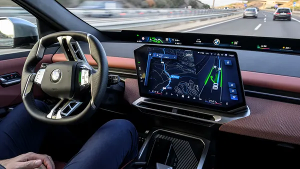
But if there’s a single word all automakers should live by, it’s redundancy. BMW’s 7-Series does it best, allowing nearly everything to be accessed three ways: by iDrive controller, touchscreen and voice commands. And there are additional hard buttons on the dash and steering wheel, as well as more faddish gesture controls, to adjust radio volume, for example.
Redundancy is a design philosophy worth proliferating – and we’re counting on it to trickle down to lower-cost vehicles over the next few years.


